Dentsu Inc. Tokyo
Nikka Whisky × Dear Difference
- ClientTHE NIKKA WHISKY DISTILLING CO., LTD.
- AgencyDentsu Inc. Tokyo
- Executive Creative DirectorYoshihiro Yagi
- Creative DirectorShohei Maeda
JUAN SEBASTIÁN MORENO When a single shape becomes the foundation of an entire visual language, design transcends communication and becomes art. A masterclass in restraint, proving that the simplest ideas often create the richest visual worlds

Nikka Whisky's Quiet Rebellion in Dots and Difference
There is a particular kind of confidence in refusing to look "Japanese" when the whole world expects you to. That was the starting instinct behind dear difference, the campaign dentsu Tokyo built for THE NIKKA WHISKY DISTILLING CO., which went on to collect a Gold and Bronze in the Industry Craft Lions and a Silver in Design at Cannes Lions 2026. Creative director Shohei Maeda has said the team deliberately avoided reaching for familiar cultural signifiers. Instead of styling something that reads as recognizably Japanese, they kept returning to a harder question: what is the true essence of the brand carrying the name of Masataka Taketsuru, the founder often called the father of Japanese whisky.
That search mattered because Nikka's flagship name has been under quiet pressure. A prolonged shortage of aged malt has chipped away at its market presence, even as the brand's reputation abroad remained strong. The answer the team arrived at was not a slogan so much as a worldview. Difference, they decided, is not a flaw to smooth over. It is the raw material of everything interesting a blend can become.
From No Labels to Dear Difference
The campaign did not appear out of nowhere. It builds on No Labels, dentsu Tokyo's earlier work for Nikka that stripped away literal and figurative labels, race, gender, title, in favor of a simple picture of people enjoying whisky as themselves. That earlier project had already won recognition at Cannes and swept multiple Lotus Awards at ADFEST, and it set the emotional groundwork for what came next. Dear difference picks up that thread and pushes it further, translating an abstract idea like harmony or blend into something people can actually see and feel.
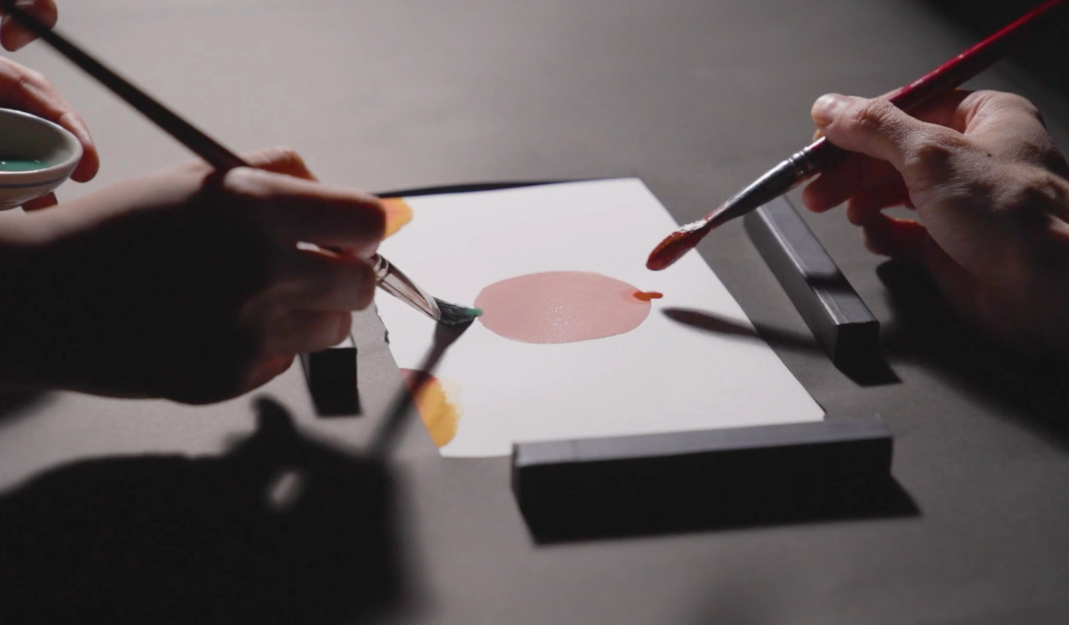

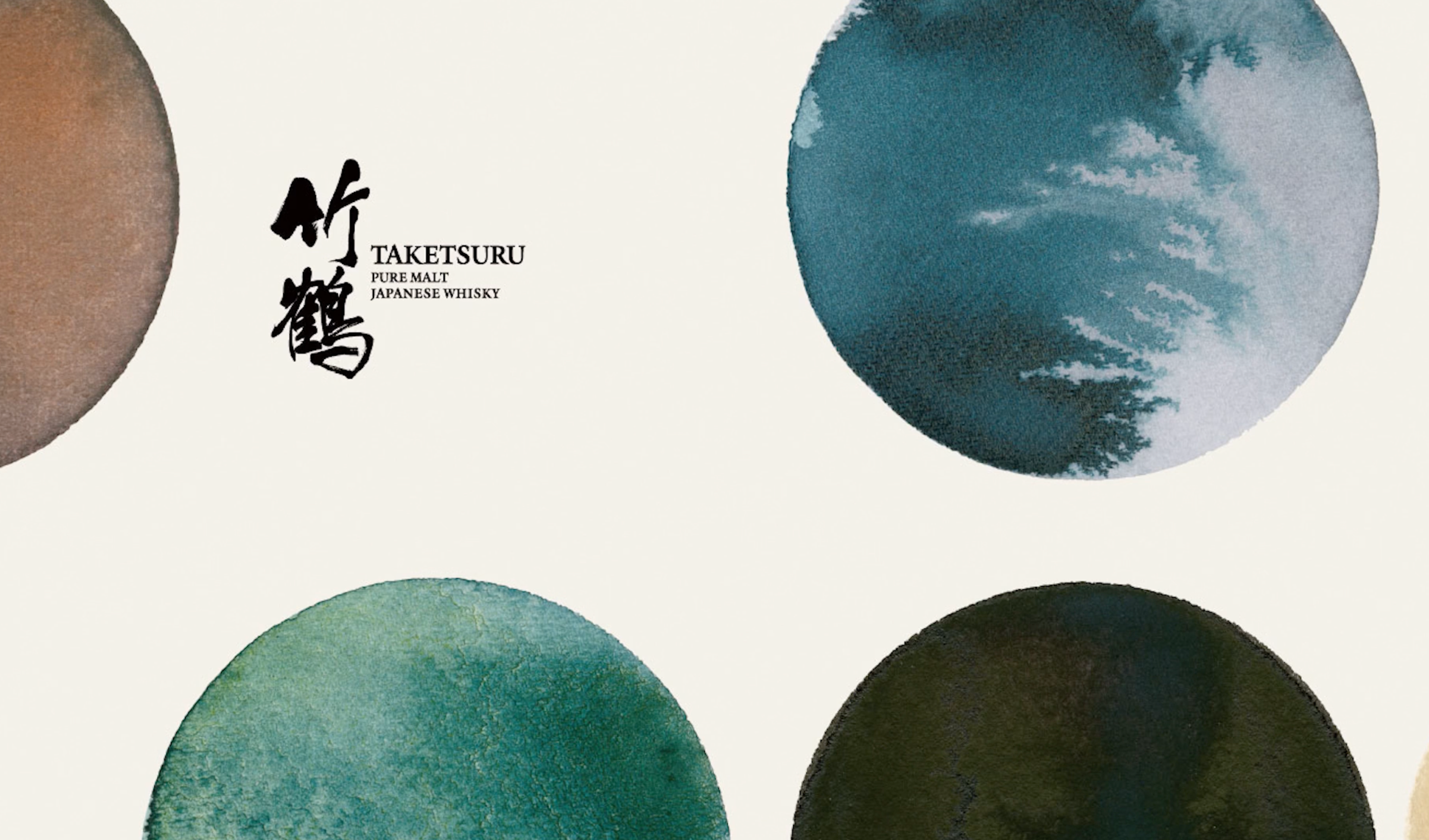
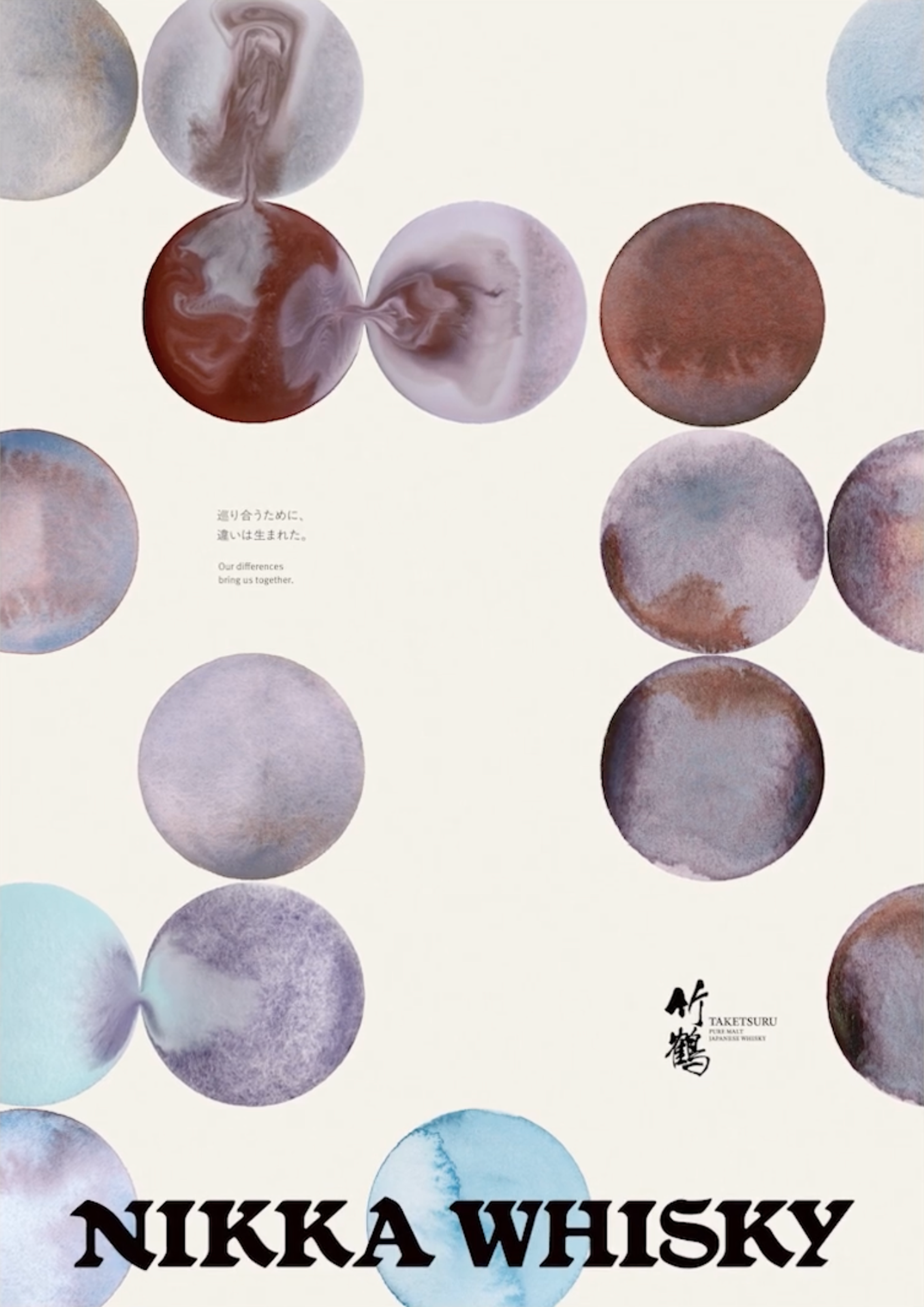
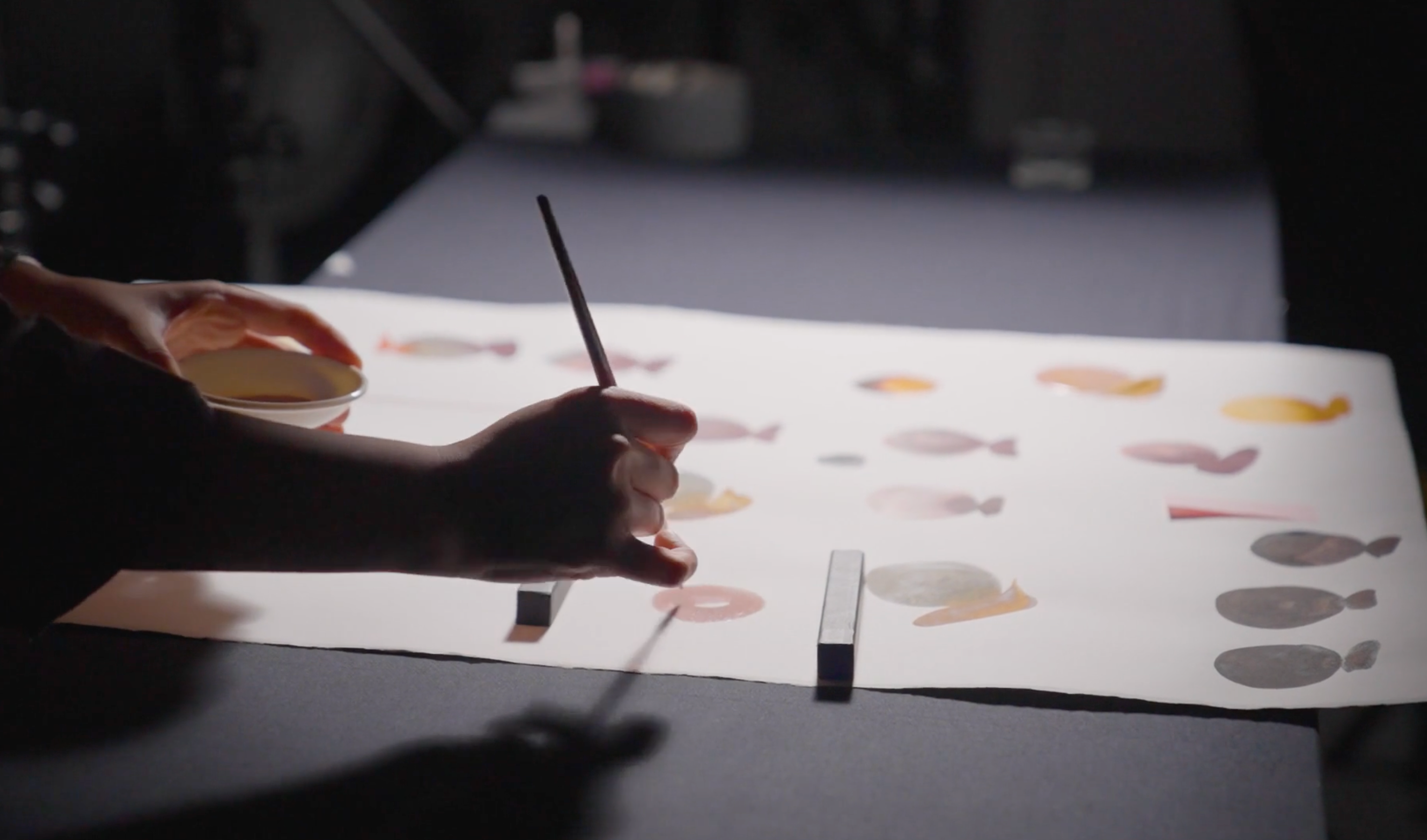
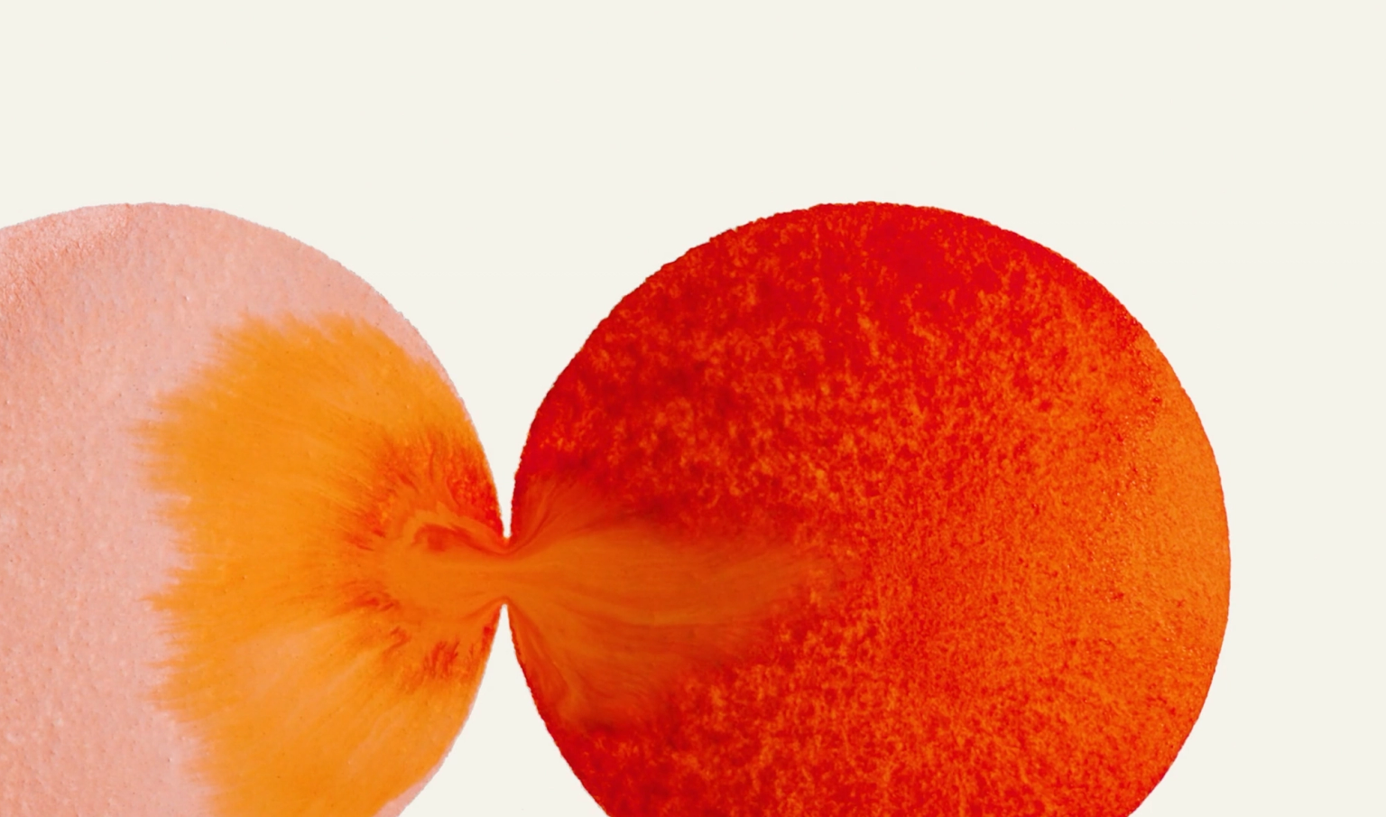
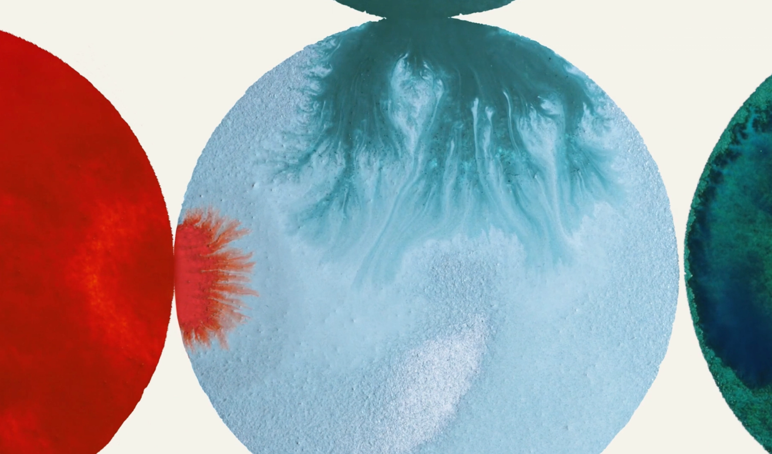
The visual language they landed on is built from dots, small, individual marks that overlap, separate, collide, and reconnect. Each dot stands for a unique character. As they meet and merge, they generate entirely new forms, a visual echo of what happens inside a blended whisky and, by extension, what happens when different people, cultures, and ideas come into contact. Maeda has described the underlying belief plainly: when different things meet and accept one another, new value emerges. The campaign's title became the team's shorthand for that conviction.
Rather than lean on the conventional luxury codes so much whisky advertising relies on, glass, amber light, oak barrels, the team chose to dial down to the elements that actually make up the product and the story. It was a deliberate move away from category tropes, aiming for something that felt intellectually and emotionally distinct rather than simply premium.


A Bar Built on the Same Idea
The philosophy did not stay confined to print and design. It extended into space, most visibly through THE NIKKA WHISKY TOKYO, a flagship bar concept that first opened in Omotesando before being recreated as a pop up during Cannes Lions itself. Rather than positioning it as a traditional brand bar, the team designed it as a meeting point, somewhere different people, ideas, and perspectives could gather over a drink. Around eleven hundred visitors passed through during the festival.
The bar even had its own edible extension of the concept: a Cannes exclusive cocktail called dear difference, built on a whisky sour base and designed around contrast, pairing the smoky character of Yoichi with the floral elegance of Miyagikyo. It was, in miniature, the entire campaign argument. Two very different things, brought together on purpose, becoming something neither could be alone.
What ties the whole project together, from the founder's century old philosophy to a cocktail served in the south of France, is a refusal to treat difference as a problem to be resolved. Maeda has framed the campaign's cross cultural resonance as coming from something universal beneath its very Japanese origin story, the idea that authenticity itself is the strongest bridge between a local brand and a global audience. For a whisky house rebuilding its presence after years of scarcity, that turned out to be more persuasive than any amount of polish.